Home
QGIS 4
Mapping Data
Grafton County (NH) Historical Population Data
In the previous tutorial, we created shapefiles by digitizing features from a georeferenced historical map, added attributes to these features, and then used color and labels to identify these features.
This lesson will show how to display quantitative spatial data from an existing shapefile
I. Import and Map Population Data
- Find (DON'T OPEN YET) the New Hampshire historical population shapefile I saved on the shared folder ("gnis_Grafton_ppl2.shp")
- If you are running the remote version of QGIS you can just access this file directly from QGIS
- If you are running the standalone version of QGIS, you may want to copy and paste this shapefile into a local folder on your computer (please note, even though you will only open the ".shp" [shapefile] file within QGIS, you need to paste all the related files into the same folder as the .shp file (so the .cpg, .dbf, .prj, and .shx)).
- Open QGIS
- Create a New QGIS project
- Save it as "[yourName]_NH"
- Set the CRS (Project --> Properties --> Set CRS??) to WGS_84 (EPSG: 4326) if it is not already.
- Open a Base Map (Web-->QuickMapServices-->[Select a base map of your choice])
- Import the shapefile ("gnis_Grafton_ppl2.shp") of NH town population data for Grafton County, NH
- Import it (Layer --> Add Layer --> Add Vector Layer), select "…" and navigate to where the shapefile of town population data is saved
- Select Add
- It should prompt you to select the CRS projection for the layer, select WGS_84 (EPSG:4326)
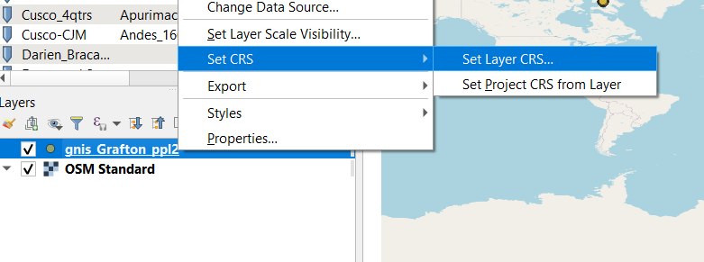
- If you are not automatically prompted to select a CRS, do so for the NH pop data by right-clicking on the gnis_Grafton_ppl2 shapefile in the Layers window and selecting Set CRS
- The NH towns shapefile layer should now appear in the correct place.
- To zoom in on the towns of Grafton County, NH, right-click the shapefile layer and select Zoom to Layer. You should see something like this:
- You can change the symbols for the towns by right-clicking the towns shapefile --> Properties --> Symbology tab. Then you can either:
- With Single Symbol and Marker selected at the top, you can change the color and size of the symbol, or choose one of their preset symbols in the box near the bottom. You may also adjust the Opacity setting under the Layer Rendering tab.
- OR you can customize the symbol more by selecting Simple marker at the top, which allows you, among other things, to change the color and thickness of the symbol's outline.

II. Visualize Historical Population Data for these towns.
- Review the population data stored for each of these towns by right-clicking the town shapefile and selecting Open Attribute Table.
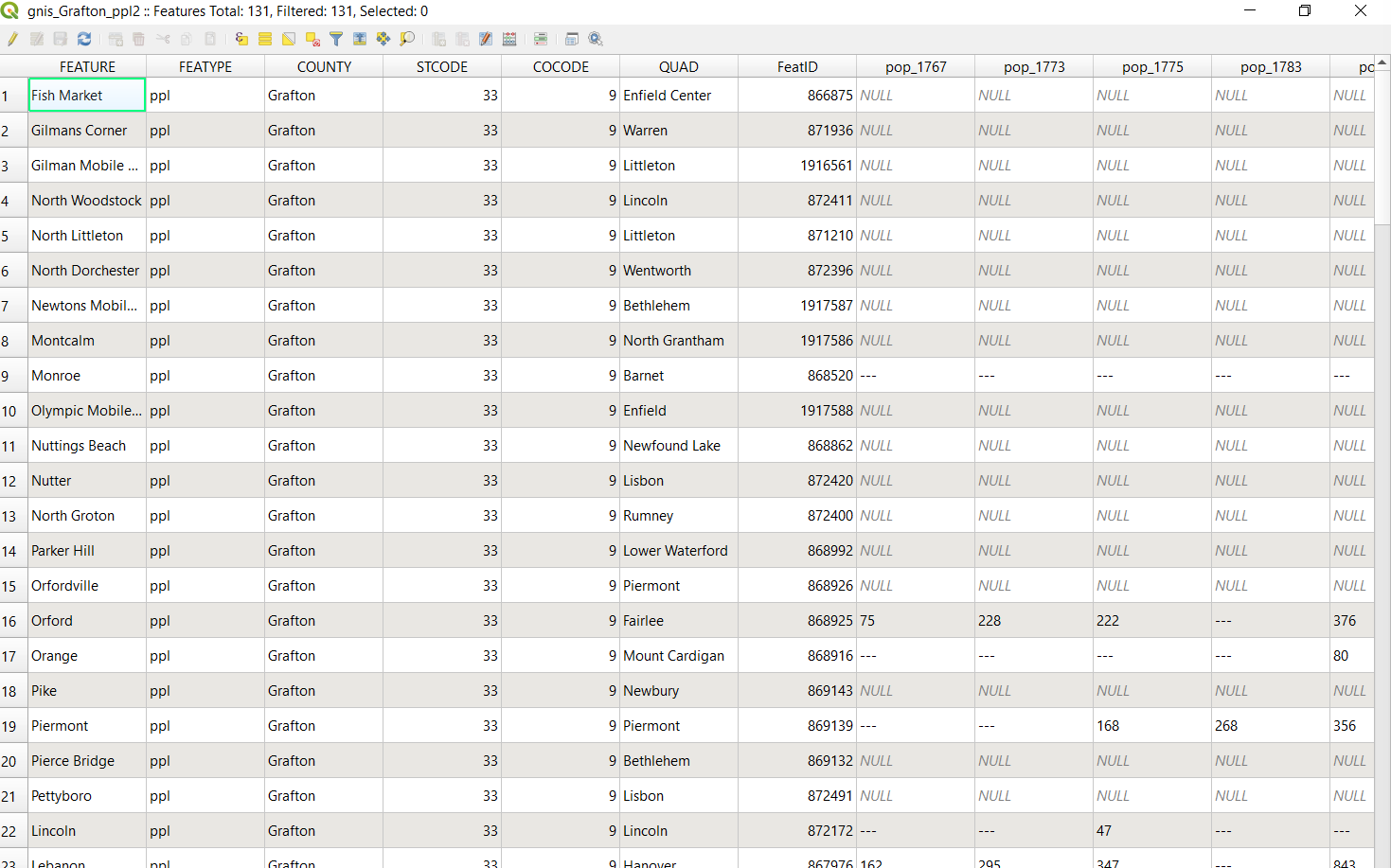
- Scroll across and down the table. For what years is there population data? How complete is the dataset? Is there a lot of missing or "NULL" data? Why do you suppose that is?
- Close the Attribute Table
- We will now visualize population distribution in Grafton County, NH for 1890 (the same year as the georeferenced map we worked on in the third tutorial and a year before Christy Warden's murder in Hanover). Since population is a quantifiable size variable, it makes most sense to represent the variances in town population by representing them with symbols of different size. Changing the color or shape of the symbol makes more sense when working with categorical data.
- Open the NH towns Properties window. Select the Symbology tab.
- At the top of the Symbology tab within the Layer Properties window, there will be a dropdown menu with various choices:
- "Single Symbol" = one common symbol for all towns
- "Categorized" = applying different symbols based on categorical data (i.e. if we had an attribute column in the shapefile recording "capital cities", "cities", "towns", and "villages")
- "Rule-based" - is for creating rules for the ways the symbol for each town is chosen. For example, if you had one attribute for town type and another for population you can assign different shapes for town type and different sizes for town population. For more on rule-based symbols click here
- "No symbols" - I believe you would only use this if you wanted to label towns but not add symbols.
- "Point-displacement" and others… (will explain later)
- Choose Graduated
- For Value select the attribute "pop_1890"
- For Symbol leave it as is unless you want to change the color or shape of the symbol.
- For Method change it from Color to Size
- Select Classify near the bottom. It will divide your population values into groups.
- You can adjust the number of Classes or the distribution Mode to see how that effects how your town populations are displayed.
- You can also adjust the minimum or maximum size of the symbols using the Size from and to drop-down menus. I will increase the maximum size of my towns to 15.
- Select the Labels tab to label your towns by their names.
- Press OK and view the results
- The result should look something like this:
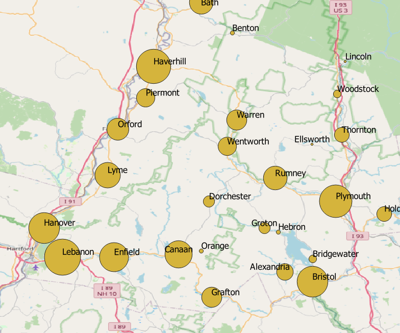
This is not the prettiest map. A better base map would help as would adjusting the font and placement of the labels. But, it conveys the information we want it to convey.
III. Create a Heat Map
- For your towns shapefile, return to the Symbology tab within the Properties window.
- From the top drop-down menu change the type of symbol to "Heatmap"
- Adjust the color ramp to your preference
- Press OK
- Review your heatmap. In what circumstances would such a map be useful? To display what types of data? How could you modify the heatmap so that it better conveys patterns within this data?
IV. Customize and Submit
Choose whether you wish to submit your population data represented as a heatmap or as proportional symbol map.
Also experiment with changes to a) your base map, b) the scale and spatial extents of your map, c) the color, shape, and transparency of the symbols, and d) the font and size of your labels
Export your map as "qgis4_[yourName]" and save it in the tutorial submissions folder.
Next Steps
- Mapping Data Part 2: Chloropleth Maps (QGIS Tutorial 5).